for WEBSITE DESIGN
Specialising in project management, construction scheduling, management and coordination and construction economics, DMOX works in the tertiary and residential housing sectors. Since it was founded in 2017, DMOX has worked on multi-trade construction, renovation and restructuring projects.
Its founder asked Made for you to improve its image and its visibility with new communication media.
Having working with DMOX to develop its brand platform to structure the company’s key messages, the agency created a logo, a website and a presentation to showcase the company’s strengths and past projects.
A more structured logo
The team improved and enhanced the existing logo by creating a comprehensive visual identity:
• The D is accentuated in a different shade of blue, making the 2-syllable name DMOX easier to read.
• The line of the roof above the company name adds structure to the logo.
• The shape of the roof is used throughout the visual identity to structure different information, becoming arrows or motifs in the background to add more emphasis and create a sense of personality.
• The typeface is simple yet striking and evokes the solidity of the company’s buildings and the serious nature of its team.
• The colours are reassuring, with dark blue used to symbolise confidence and light blue used to convey simplicity and serenity.
What our customer say
after working with us

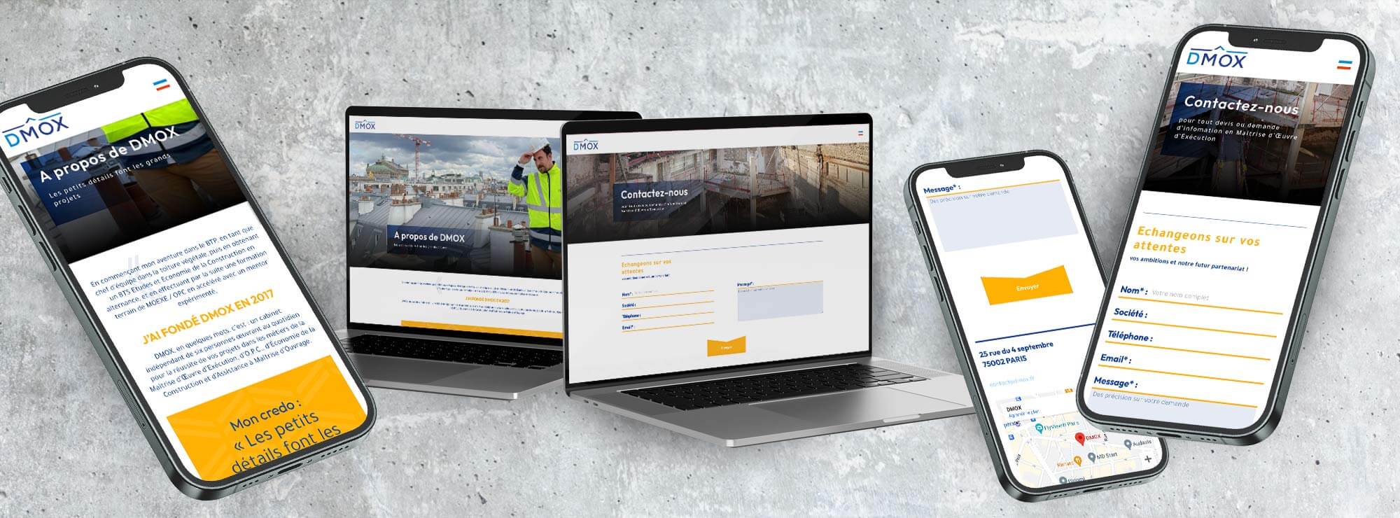
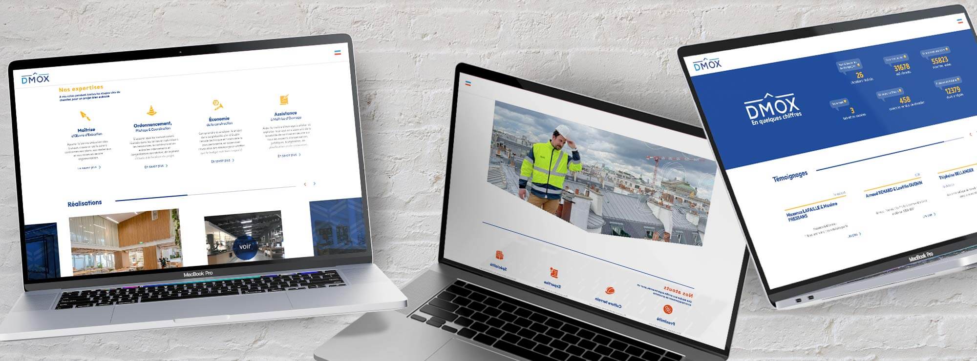
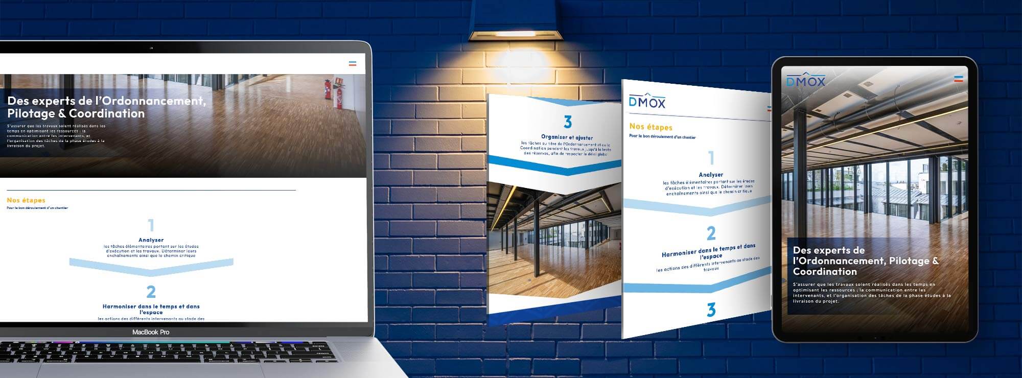
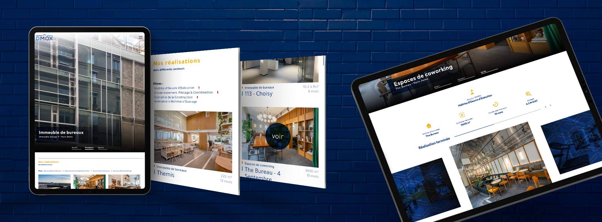
A clear, fun website
One of DMOX’s strengths lies in its day-to-day presence on the ground: in this way, it can monitor projects closely and ensure that they are properly managed, down to the smallest detail. The photos and the icons showcase the team’s expertise and give the web design a feeling of warmth, reflecting the strengths of this small company and the personality of its founder. The typeface of the texts is also modern and attractive (rounded, sans serif) and creates a sense of dynamism.
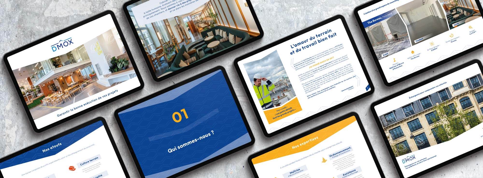
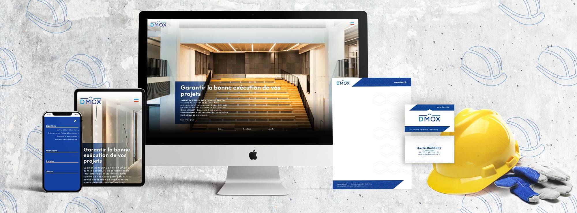
A professional presentation
The agency also designed various items of stationery (business cards, letterhead) and a corporate PowerPoint template to complement the website. The shape of the roof of the logo also inspires the geometric shapes which help to structure information and create a sense of personality.