For several years now, Made For You has worked with Canal+ International, a subsidiary of the Canal+ Group which is responsible for international activity and the French overseas territories.
As part of its work on the development of the Canal+ Group’s subsidiaries, the agency had previously designed the key visual used for its communication materials. Made For You had developed a vibrant image of the world, featuring a colour palette specific to each continent and symbolizing a world which embraces a melting pot of cultures by providing access to information and communication for everyone.
In 2022, Canal+ International wanted to update this key visual and called upon Made For You’s team once again to design an image conveying a vibrant and modern brand and to create a stronger link with its core business as a content publisher and creator of entertainment.
A new dynamic identity
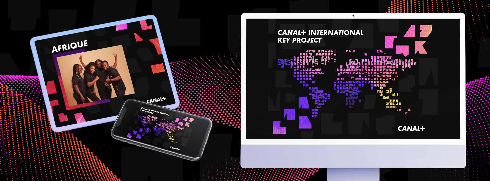
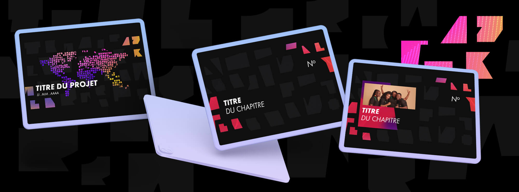
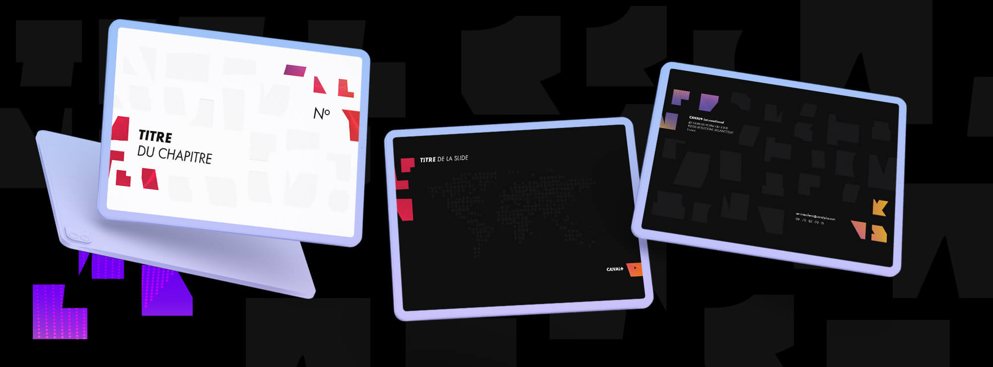
Made For You created a new key visual, inspired by an alphabet made up of geometric shapes which was developed by CANAL+ INTERNATIONAL; this visual emphasises diversity, resembling a puzzle or connected pixels, used as an opaque or gradient background.
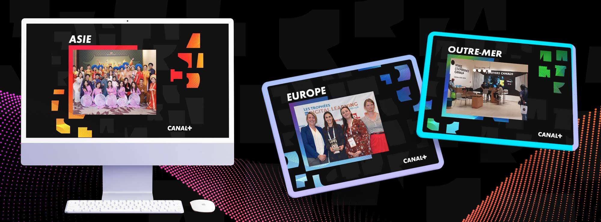
Different shades of purple are used to add a digital and modern feel to the visual. In keeping with the visual style guide, a different range of colours has been identified for each geographical area in which the subsidiary operates: Europe, Asia, Africa and the French overseas territories.
To bring this new identity to life on a day-to-day basis, the agency also designed a template for a PowerPoint presentation.
It creates an impression of movement for a dynamic brand which always knows how to remain relevant.
What our customer say
after working with us
A graphic charter to streamline communication
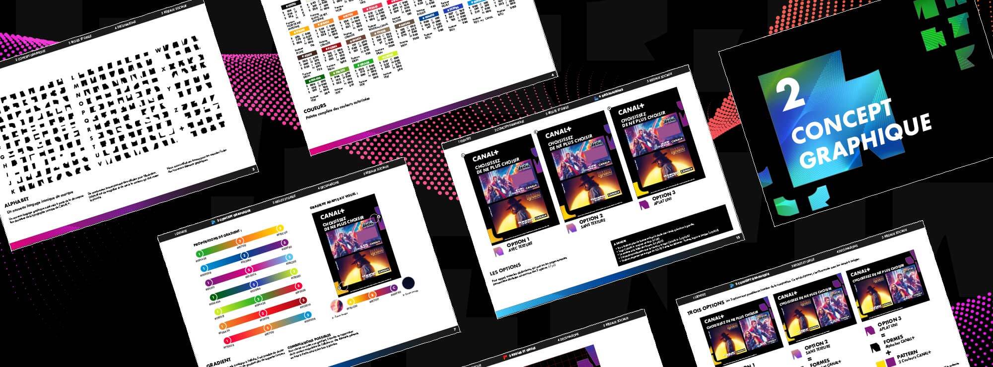
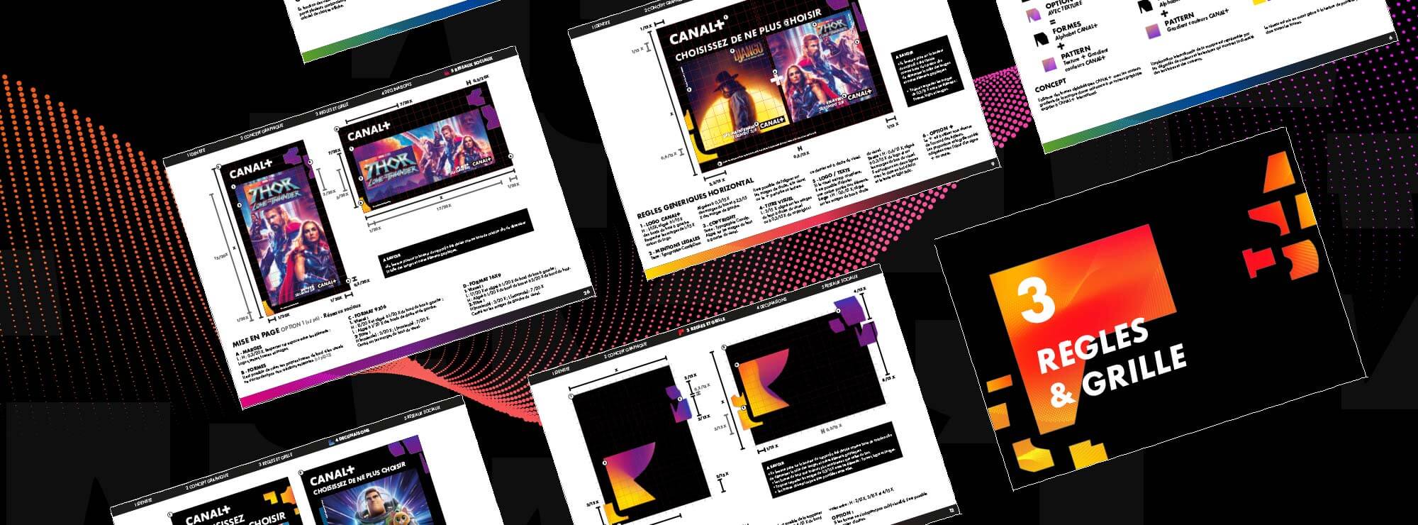
Finally, the agency created the graphic charter for the use and application of this new graphic principle, to ensure the visual consistency of future communication media and facilitate the teams’ day-to-day work.
