A Team Of Refrigeration Professionals At Your Service More Than 50 Years Of Recognised Professional Experience.
AFCE has more than 50 years of expertise in the cold chain process (thermodynamic refrigeration) for the food industry. It offers a wide range of support for its customers, from assisting with extensions for stores and warehouses to supplying refrigerated display cabinets and providing maintenance.
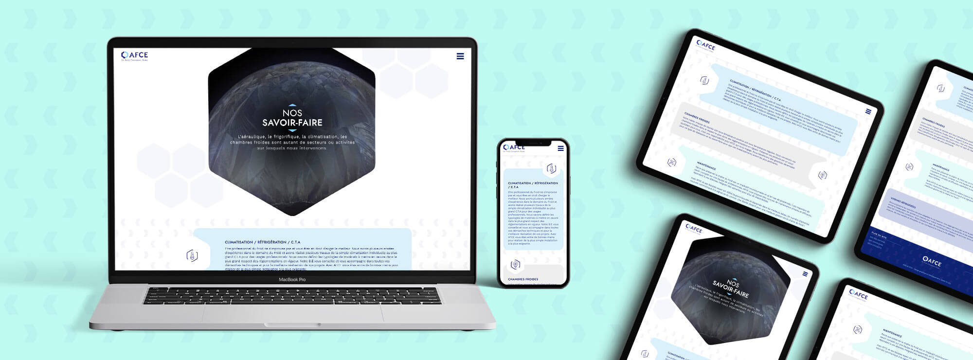
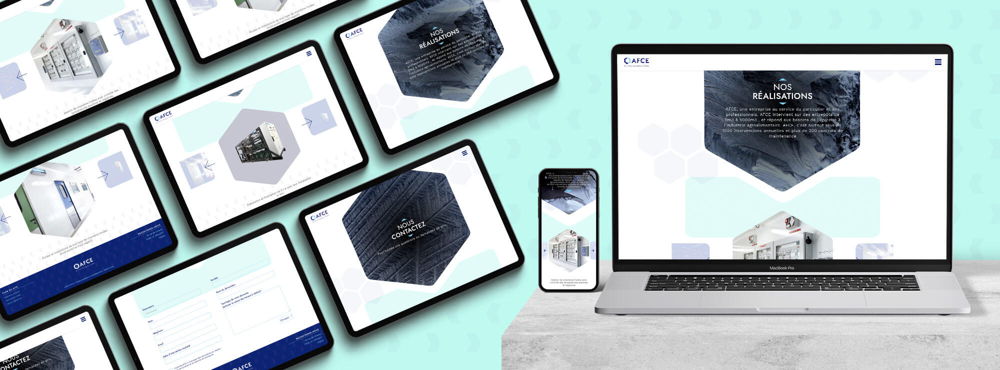
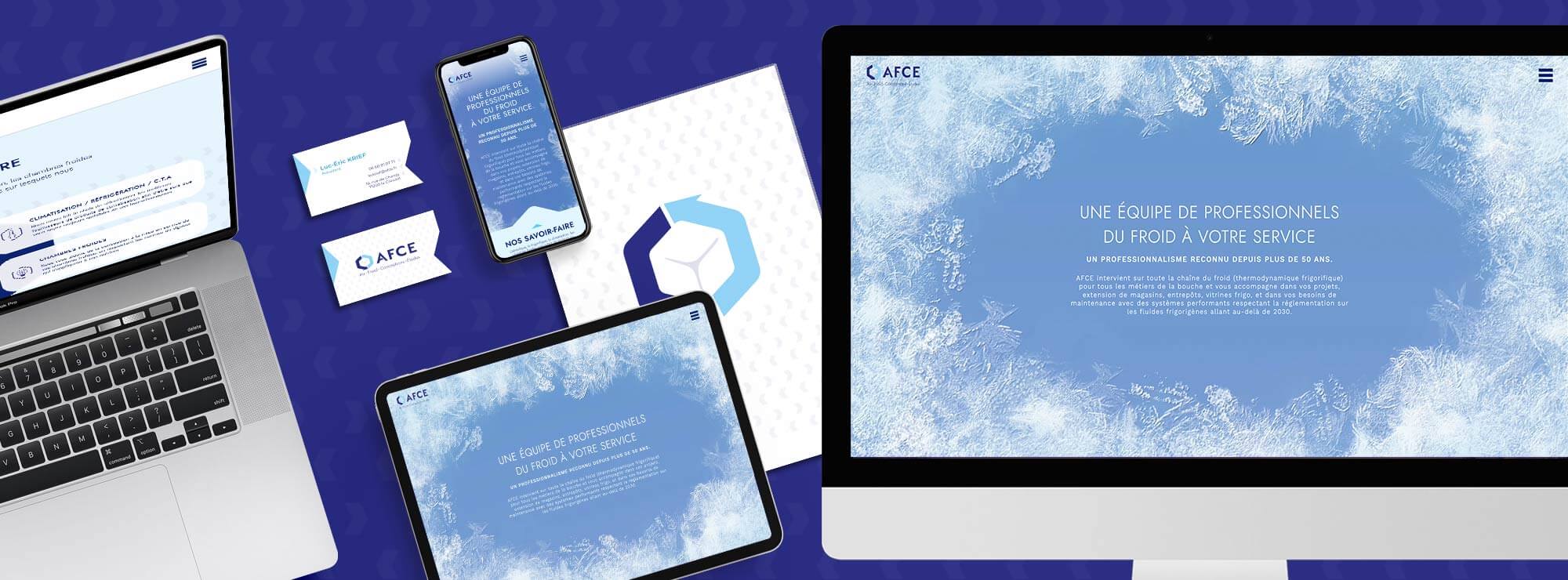
The company chose to work with Made for you to improve its image and its brand awareness with a clear and comprehensive website to showcase the company’s strengths.
A professional logo
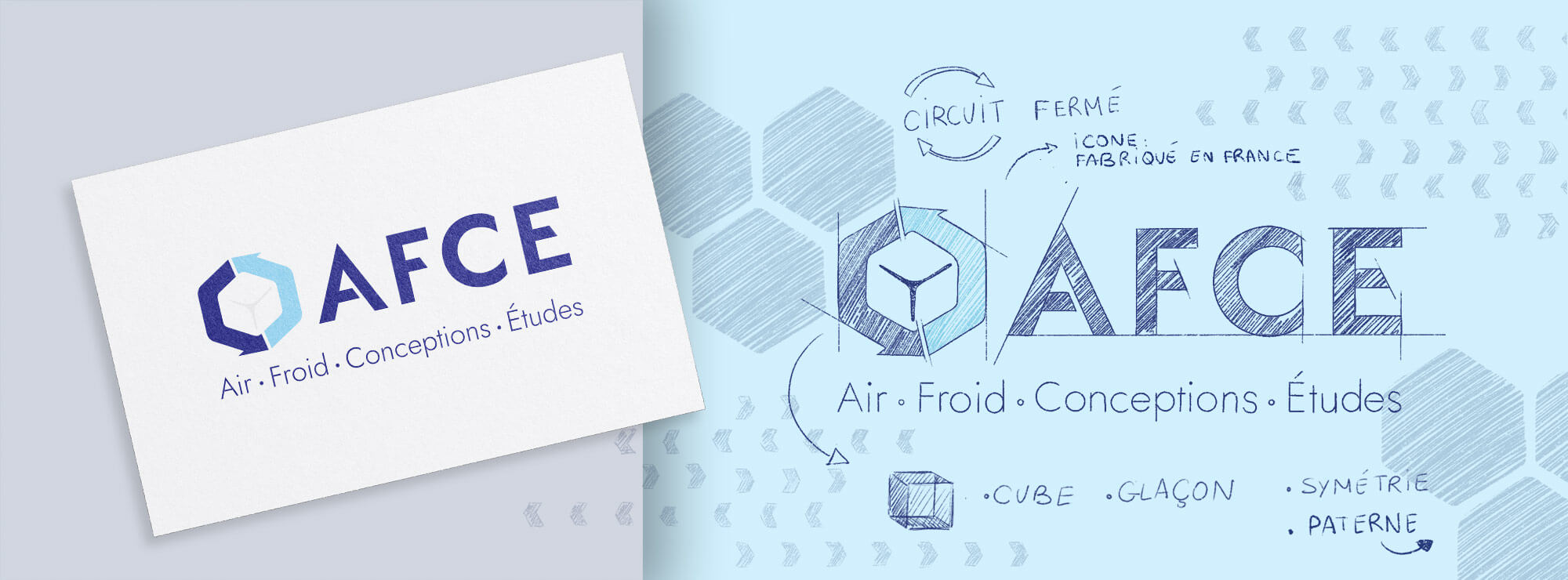
The agency designed a logo with several layers of meaning, all related to AFCE’s business:
- The arrows evoke the process of maintaining the cold chain
- The hexagonal shape depicts an ice cube and also represents the shape of France
- The bevelled typeface echoes the arrows and adds a sense of dynamism
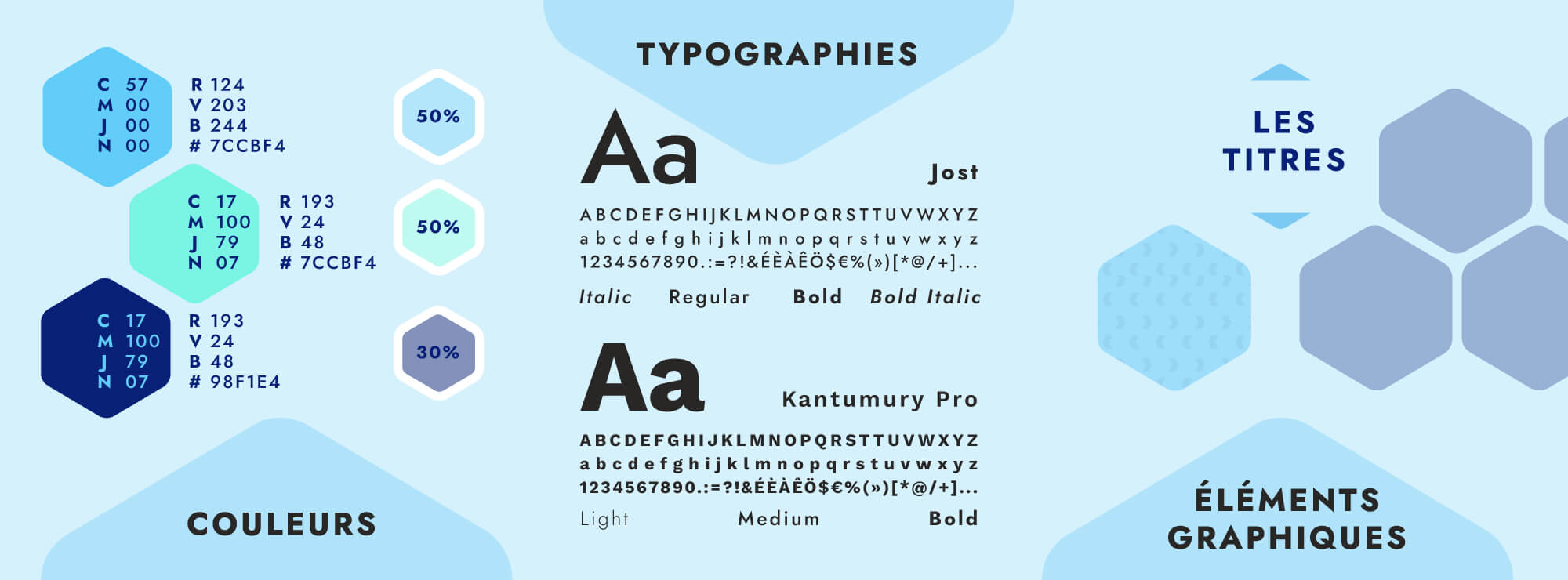
- The colours simultaneously convey cold temperatures and the team’s reliability
What our customer say
after working with us
A clear, reassuring website
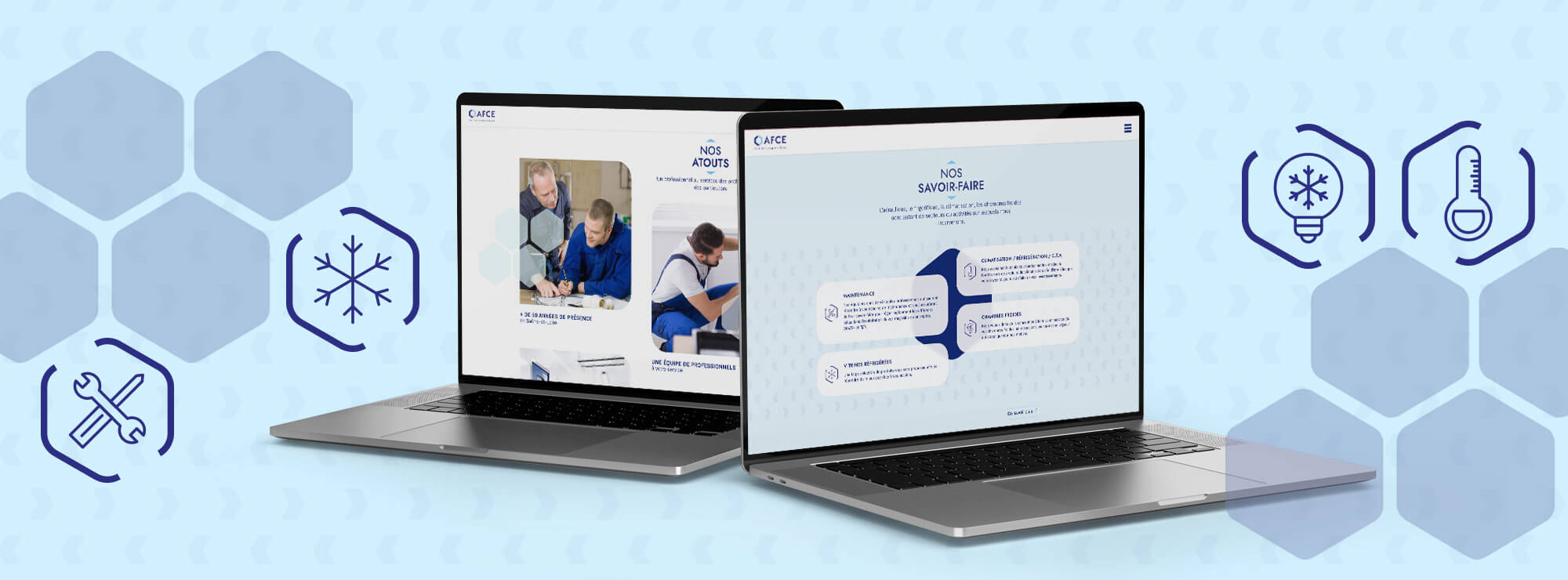
The hexagonal shape is also used for the icons and photo/text zones; it creates the website’s structure and adds real character. Arrows are also created at the base of the corner of the hexagon for a more dy
namic feel.
The photos emphasise the support provided by the company’s staff, creating a reassuring brand image with genuine warmth, despite the nature of AFCE’s business!
