Potentials provides training and coaching, offering innovative and bespoke plans and solutions to support managers and employees.
Its founder asked Made for you to create a meaningful visual identity and an original and dynamic website, reflecting its ambition to reinvent the world of training.
A logo in motion
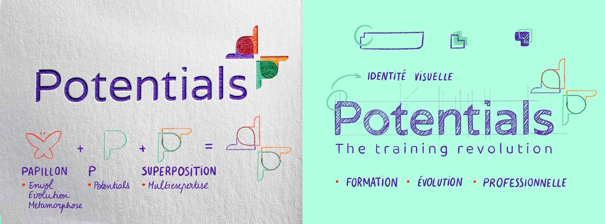
After developing Potentials’ brand platform to structure its messaging and clarify its identity, the agency created a logo with several different layers of meaning:
- The 4 Ps (recalling the company’s name) form a butterfly which evokes transformation, flight and metamorphosis: by sharing its expertise and experience, Potentials aims to reveal people’s untapped potential, helping them to develop, take off and fly high
- Each P evokes a certain part of the company’s expert knowledge: the 4 overlapping letters illustrate their complementary nature (digital and traditional, face-to-face and distance learning, experience and innovation) and their wide-ranging areas of expertise (office automation and computing, digital technology, languages, accounting, finance, legal, sales and more)
- The 2 Ps can also be combined to form a heart, symbolising personalised support and soft skills
- The dot over the I is an arrow, representing the future, movement and change
- The typeface is modern yet understated and designed to be distinctive (the dot on the I and the indented corners of the P and T)
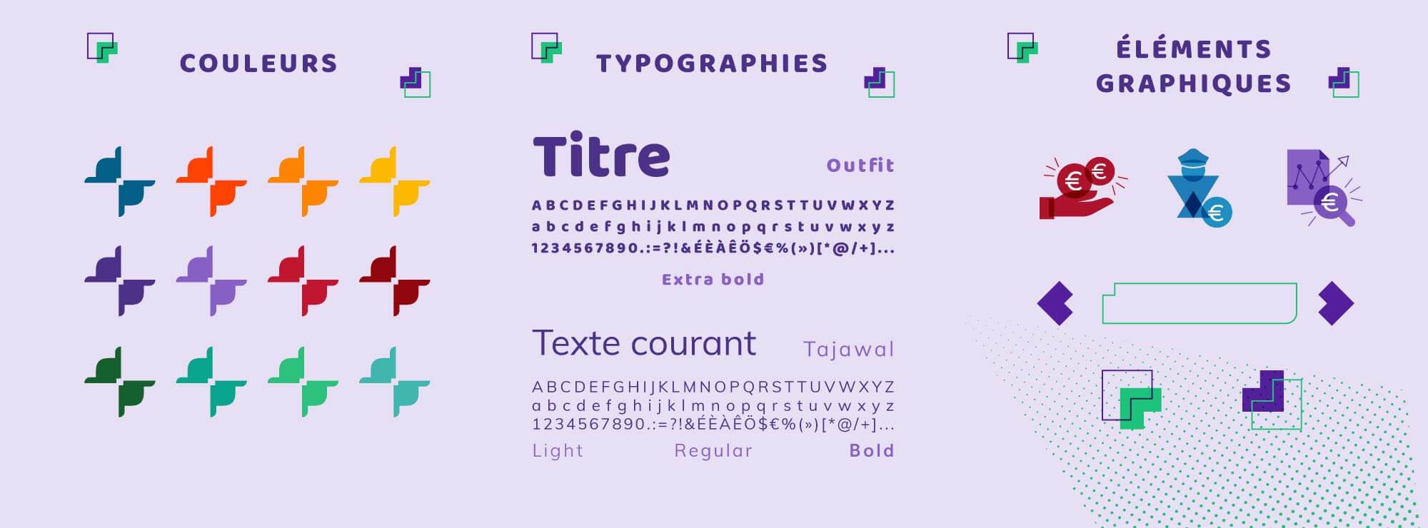
- The colours also evoke innovation and digital technology (purple) and are bright and dynamic (red, orange, green)
- The signature, “The training revolution”, reinforces this idea of change
What our customer say
after working with us
A vibrant visual identity
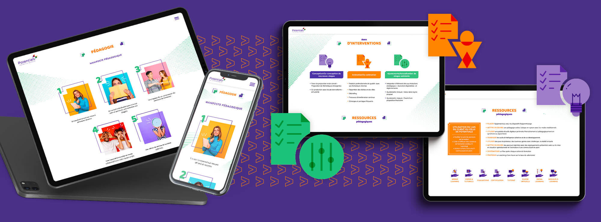
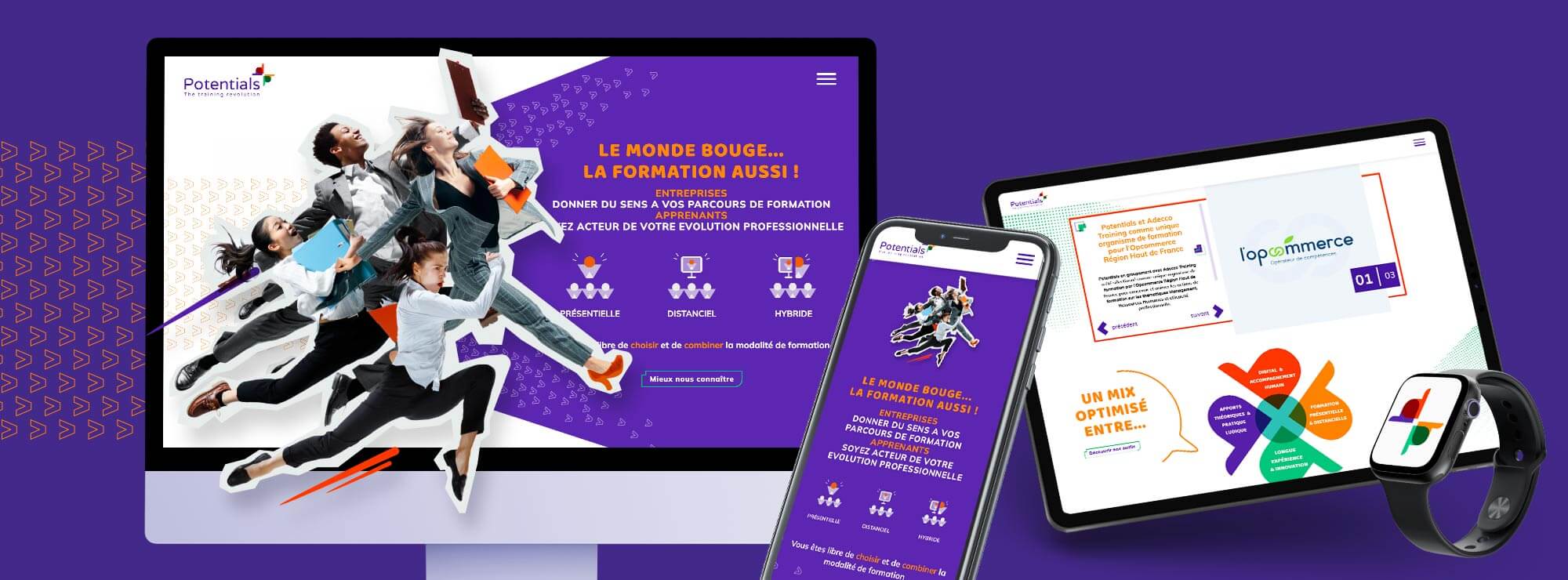
A comprehensive visual identity, inspired by both the logo and the typeface, is featured in the website’s design:
- Arrows are used in the background to symbolise movement, evolution, the future
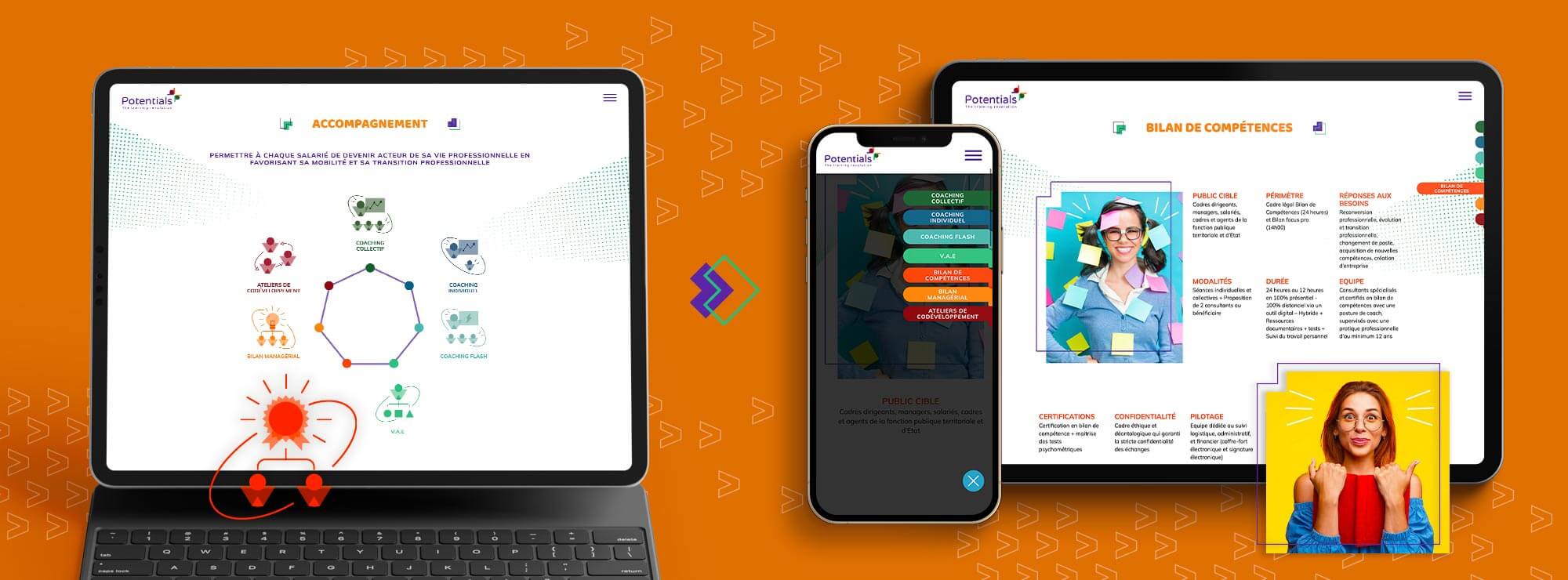
- The indented corner used in the logo’s typeface is also used for the website’s buttons and other text boxes to give the website more personality and dynamism
- The butterfly becomes a clover to emphasise the previously mentioned complementary nature of Potentials’ expert knowledge (digital and traditional, face-to-face and distance learning, experience and innovation, theory and practice)
- Transparent effects and colours are used to create a range of unique icons, giving the web design a real sense of personality

A dynamic and fun website
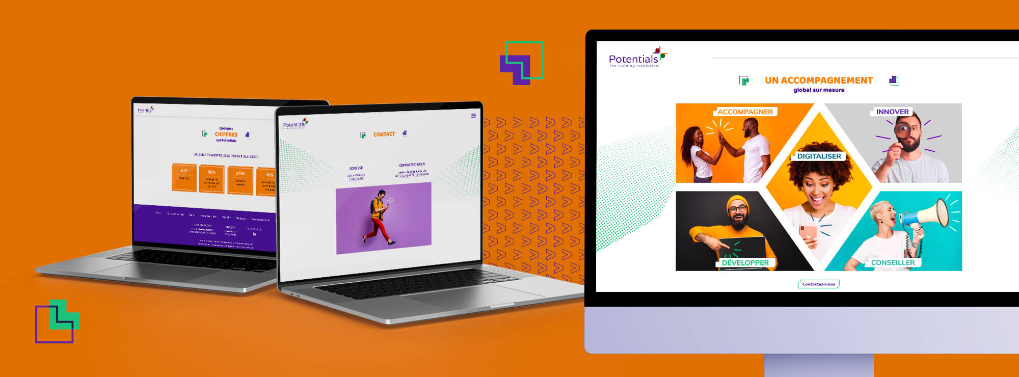
Thanks to the varied and colourful visual identity, the web design is particularly vivid.
To highlight Potentials’ people-oriented focus, since the company supports managers and employees, the website also includes plenty of photos.
These photos are dynamic (showing people in motion), cheerful (showing smiling faces) and deliberately quirky to break with the industry’s rather stuffy traditions and illustrate this “training revolution”.
The modern, rounded typefaces also give the website a warm, welcoming feel.
