After the “Harmony Project” campaign created by Publicis in 2018, ENGIE’s visual identity was created: a graphic charter featuring a double frame and images depicting ENGIE’s raison d’être and emphasising the company’s people-oriented focus.
In 2020, ENGIE asked made for you to adapt this visual identity from a more operational point of view; a hundred-page graphic charter was created to structure and unify the group’s communication materials.
In particular, the agency focused on adapting ENGIE’s visual identity for published materials.
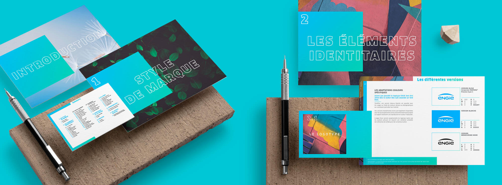
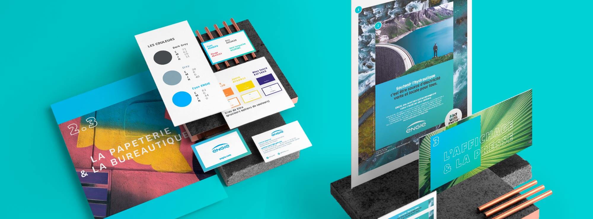
An easy-to-use charter
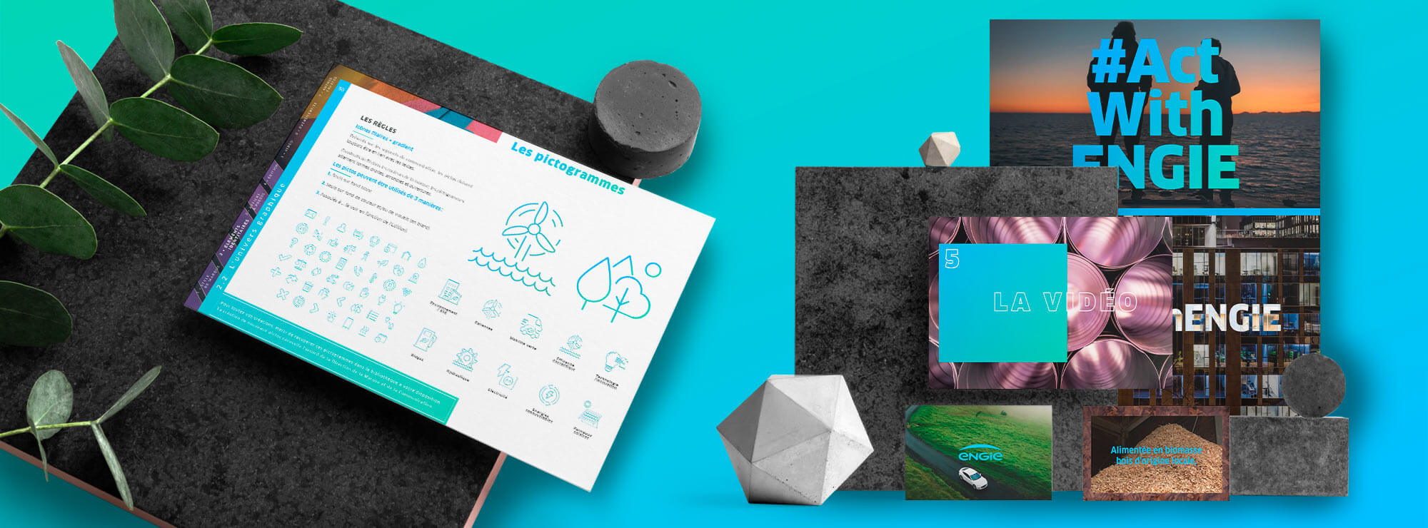
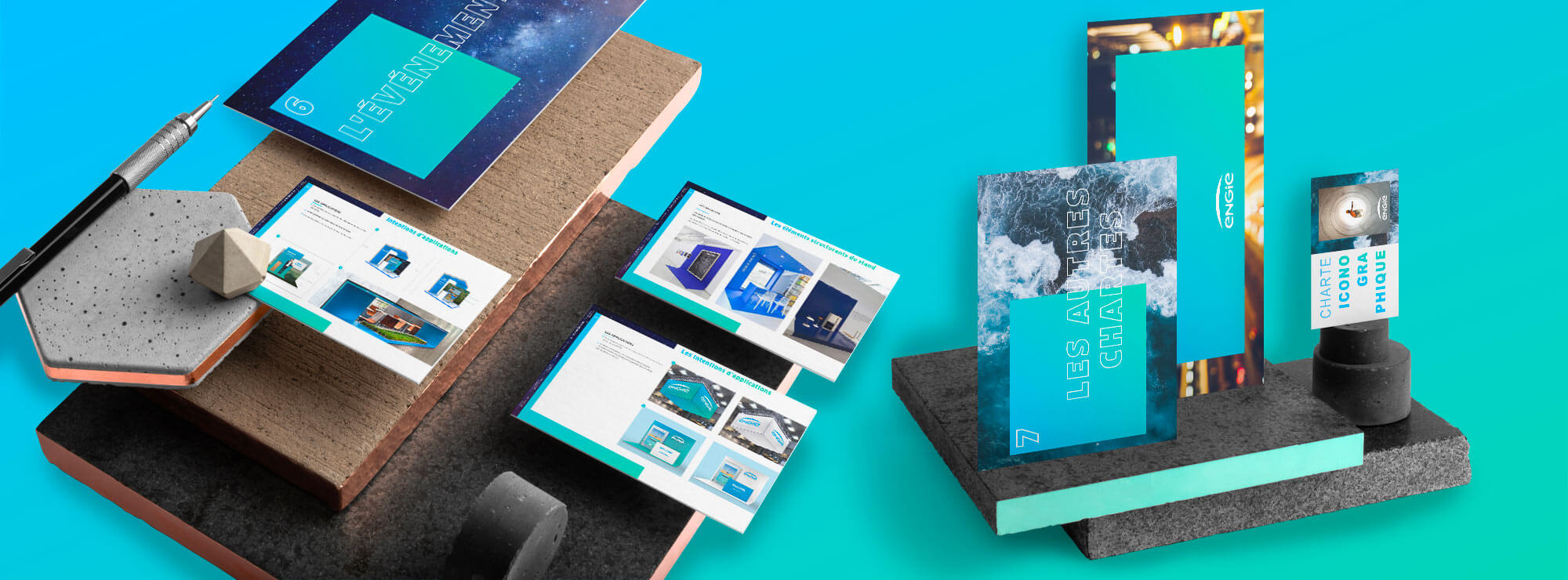
The use of dividers and sub-dividers makes it quick and easy for all users to access every part of the charter.
What our customer say
after working with us


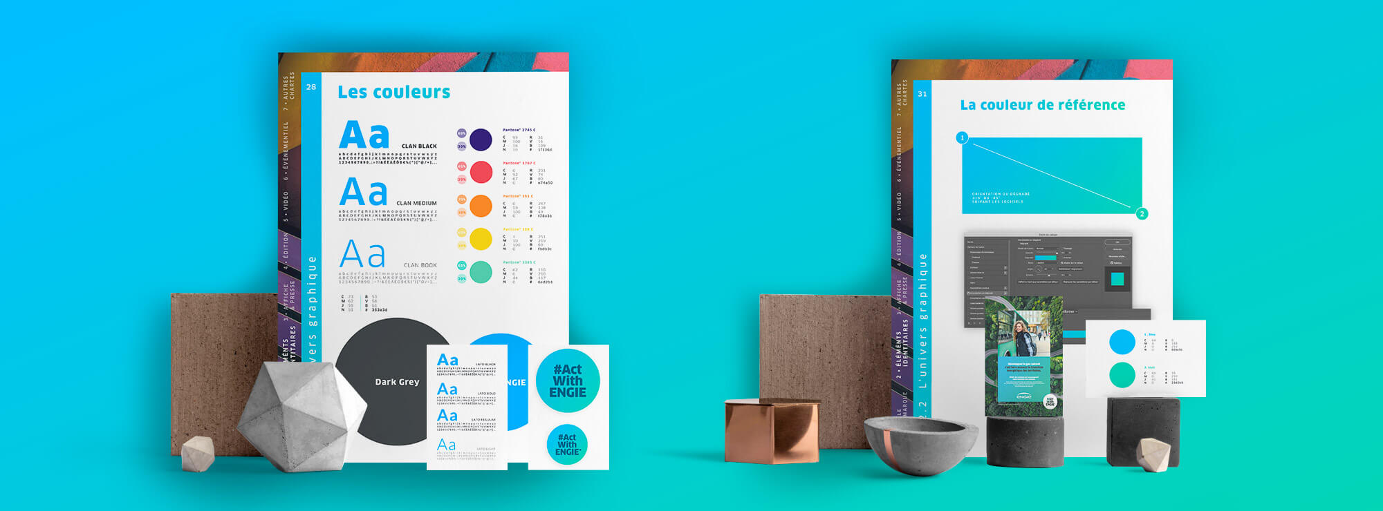
A unified brand image
Made for you adapted the existing graphic elements to adapt them for publishing and to create a uniform visual identity.
In particular, the colour palette was expanded and further use was made of gradients.
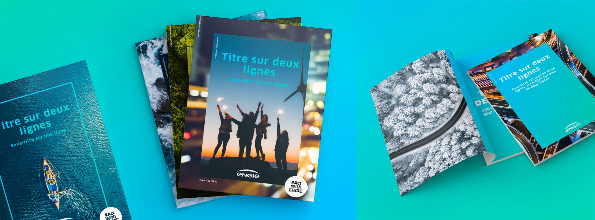
Graphic principles for publishing
The agency developed principles for publishing which are simple to use, with chapter openings which stand out from the rest of the document’s layout, including large images and colourful frames.
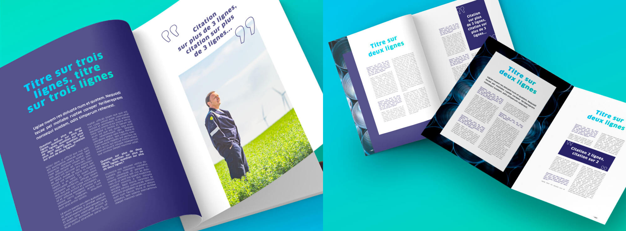
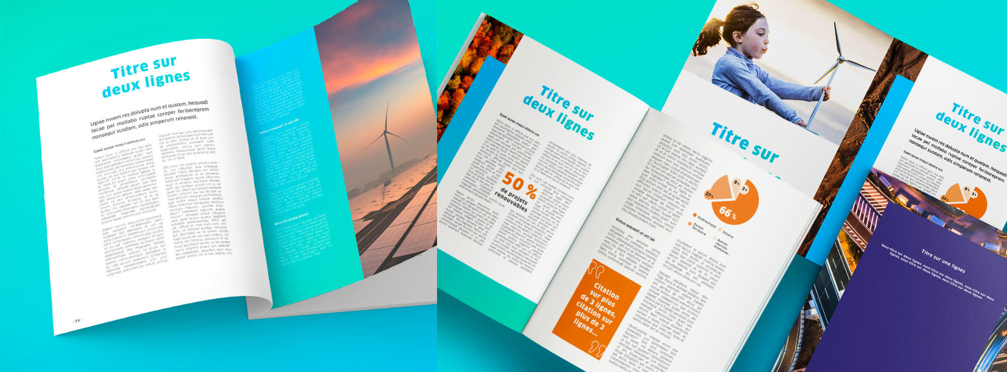
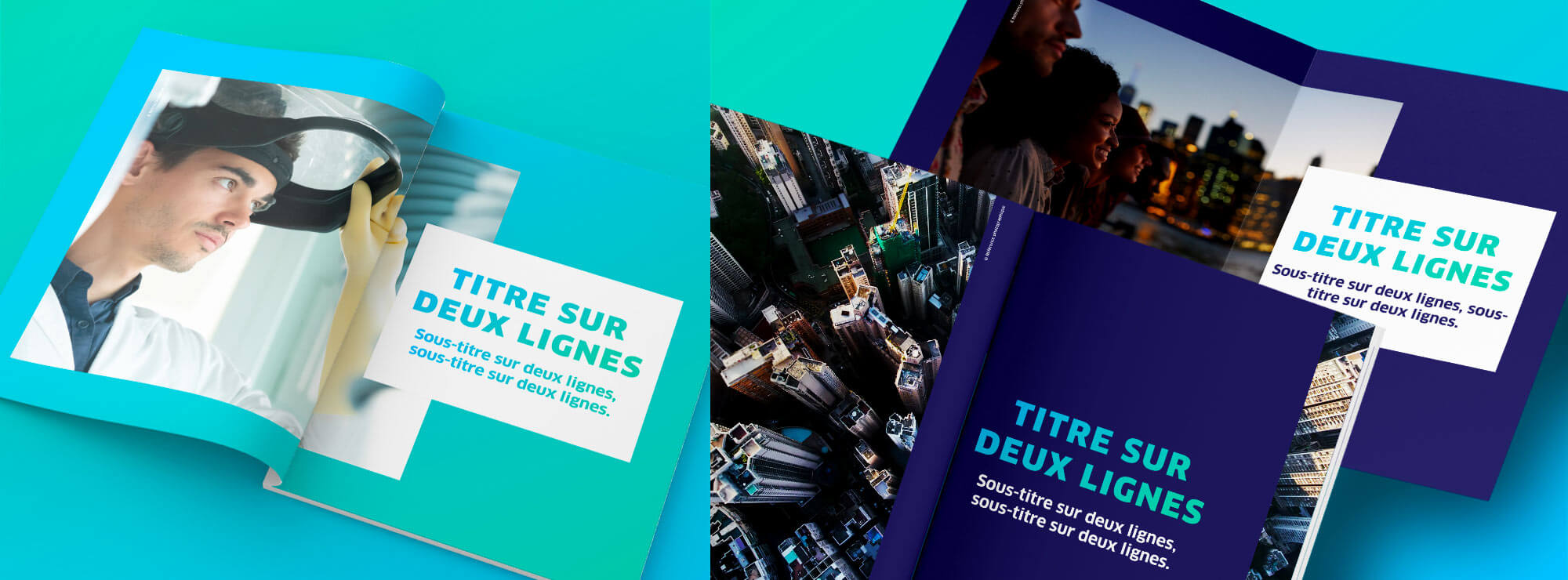
A rhythmical layout
To provide variety while maintaining overall consistency, two different layouts with different templates were created for articles and interviews. Both feature ENGIE’s key visual elements: people and production sites.
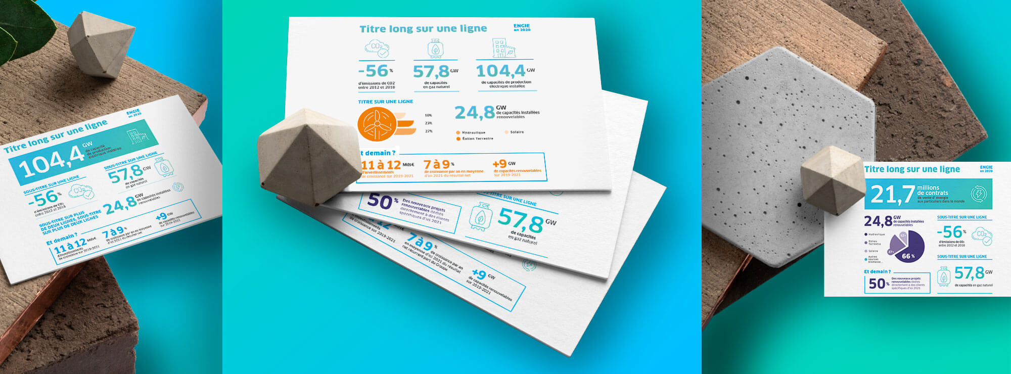
Graphic principles for infographics
Principles were also developed for infographics. These visual representations are created in accordance with ENGIE’s existing visual identity, particularly when it comes to icons and gradients.