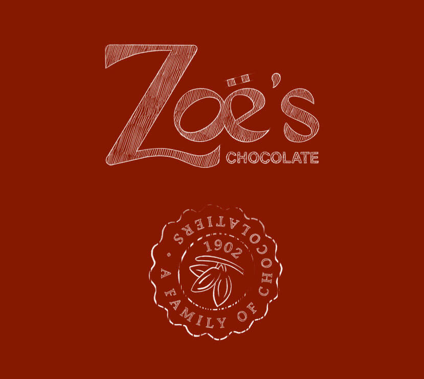
The customer and their needsZoë’s Chocolate is a family-run chocolate shop born out of a strong history of tradition and expertise. Zoë, which means "life" in Greek (the family lives in the US but is originally from Greece), symbolizes the spirit of renewal they hoped to breathe into their family after a difficult period. The family came together around the expertise of the father, an artisan chocolatier, to create a brand of artisanal chocolates. Despite products renowned for their quality and creativity (with highly original flavors), the brand lacked a visual identity and packaging with a strong identity capable of telling this story, creating a real point of differentiation from other chocolate brands, and supporting its international development ambitions (hotels, businesses, new markets).
Our creative approach
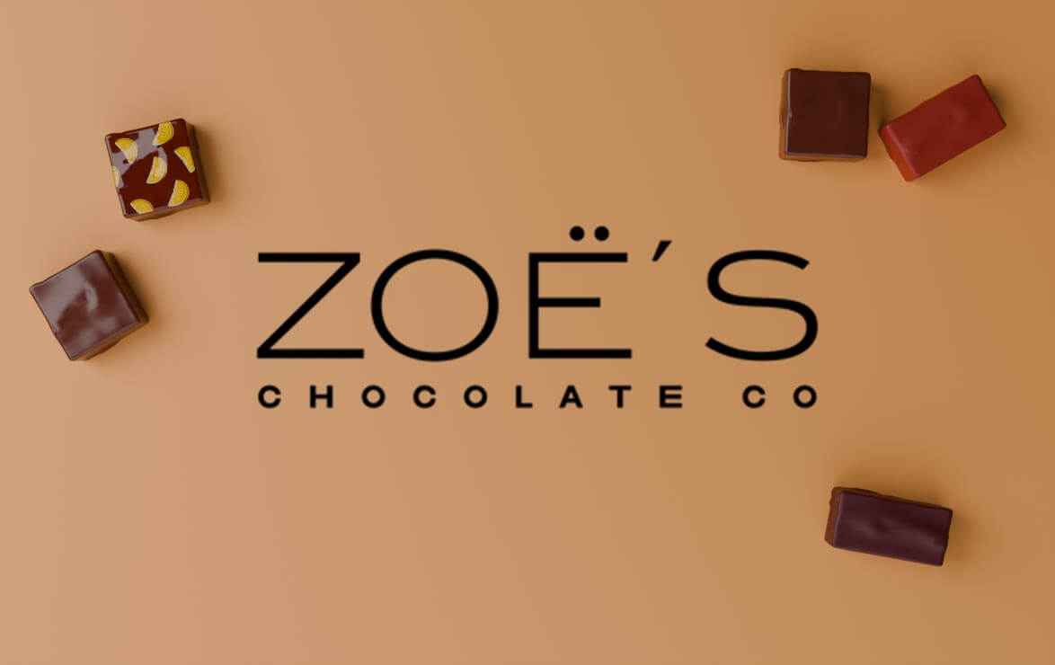
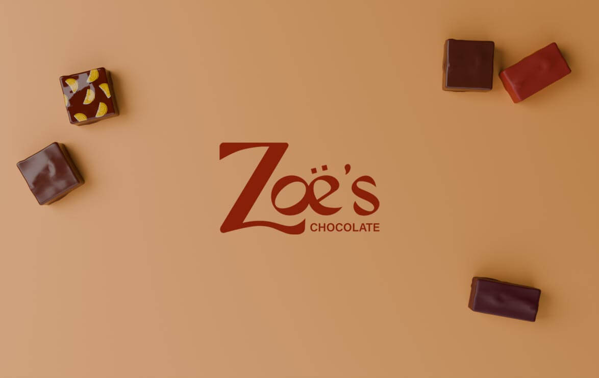
The initial request was not to change the logo, but only the packaging for seasonal chocolates (Halloween, Christmas, Valentine’s Day, etc.). However, when we worked on the brand platform together, it became clear that the logo was too classic and too cold compared to the friendliness of the teams and the creativity of the chocolates. So we came up with a new logo that is expressive, warm, and appetizing (with a "melting" handwritten font).
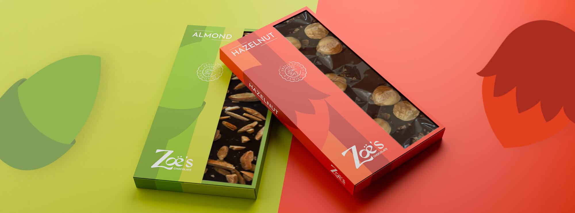
We also incorporated color through a bayadère pattern on classic chocolate bars to reinforce the brand’s cheerful, Mediterranean feel without losing its authenticity. And we created packaging that is both modern and warm for seasonal chocolates.
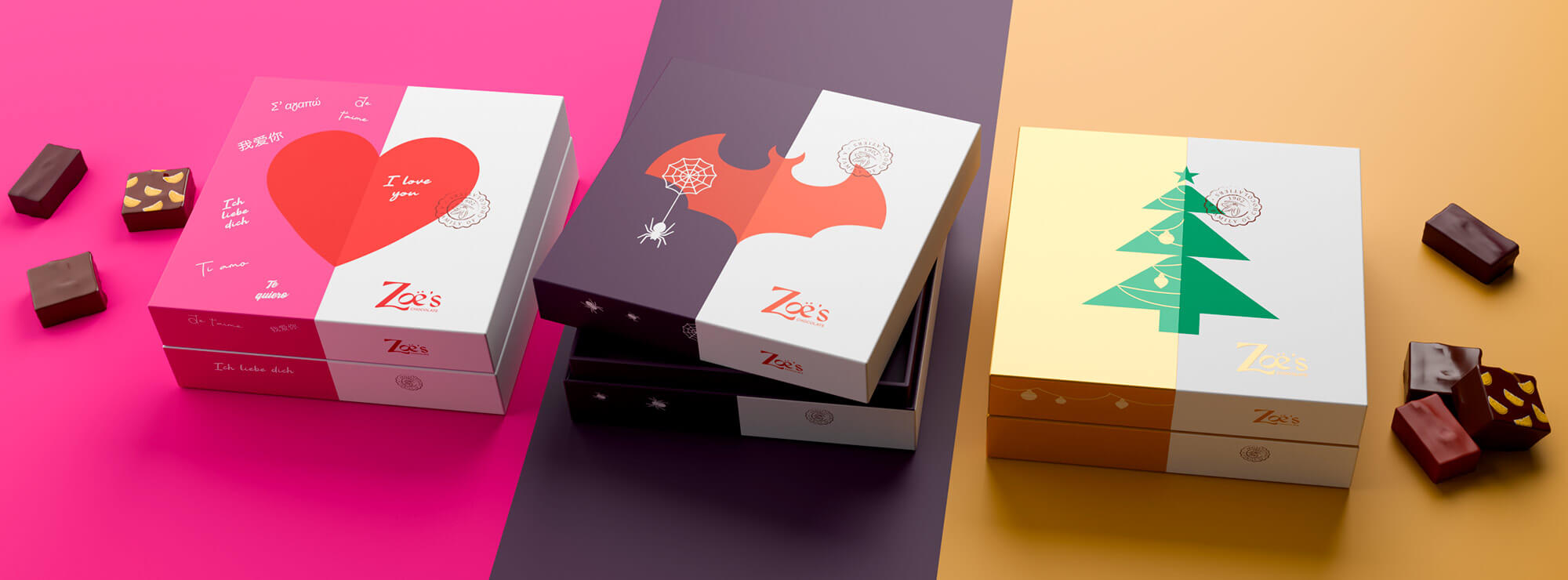
The resultA recognizable visual identity that is consistent across the board but flexible enough to highlight each product’s unique features, showcasing both the modernity and artisanal expertise of Zoë’s Chocolate. The new packaging allows the brand to stand out on store shelves, better tell its story, and confidently pursue its growth ambitions in France and internationally.