for ILLUSTRATION
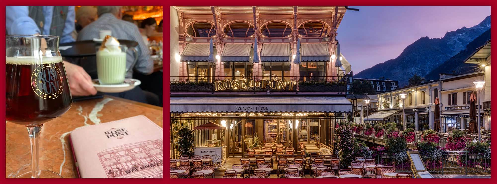
A Chamonix landmark in Art Deco style, with its colorful facade, colonnades, woodwork and old-fashioned balustrades, the "Rose du Pont" has been completely renovated by its new owner. This atypical "pink house" facing Mont-Blanc is a real eye-catcher and a magnet for tourists, thanks to its glamorous, sophisticated atmosphere, with different areas to suit all tastes: lounge, theater or balcony. Having done a remarkable job in terms of architecture and decoration, our client needed a strong visual identity and communication tools to match its ambitions.
The agency created a refined logo and a singular graphic territory, thanks in particular to original illustrations, and applied it to the restaurant’s many communication media, for a result that was right down to the smallest detail.
An elegant logo
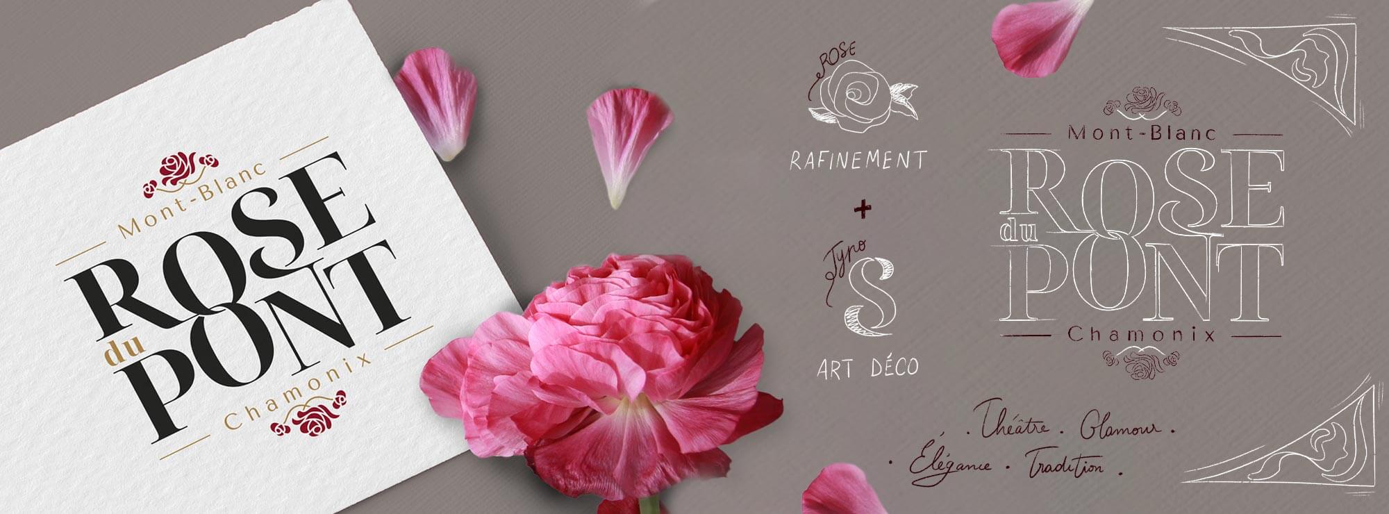
The typeface is inspired by the typical fonts of the Art Deco period, featuring serifs and plenty of curves for a traditional and stylish result.
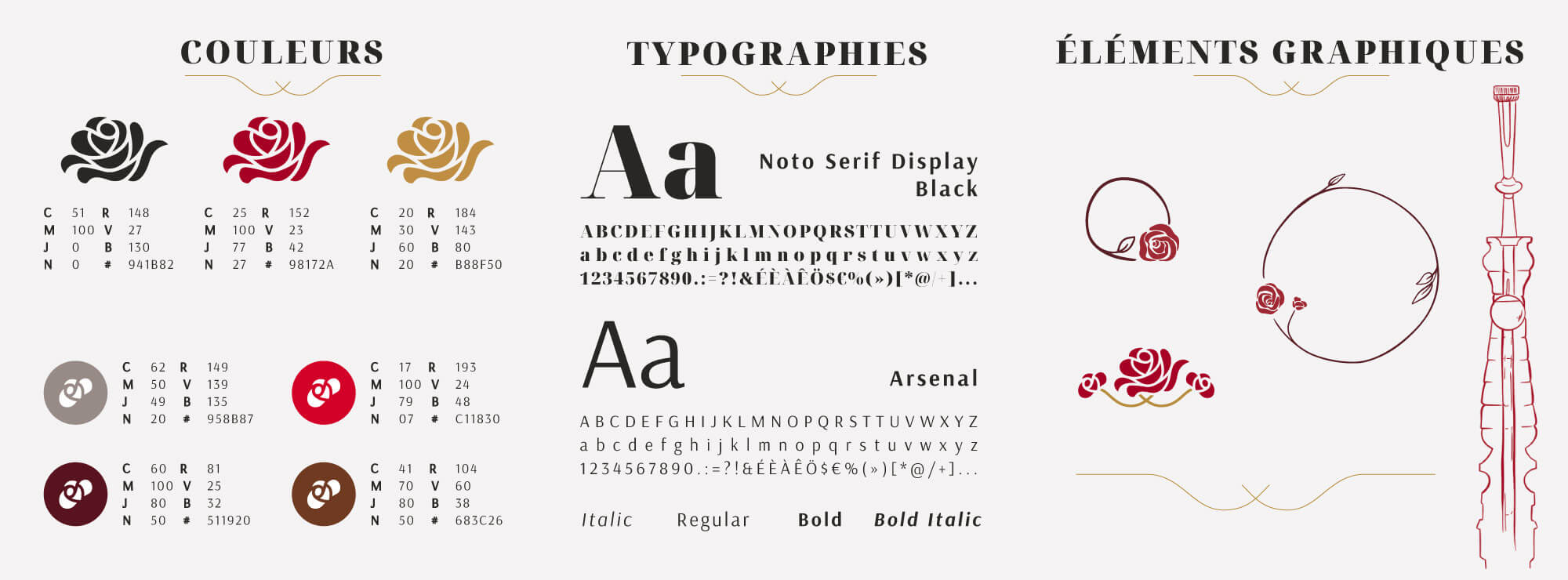
The two “O” letters are elegantly interlinked and the S connects with the N, emphasising the way in which this restaurant connects people with its focus on fun and pleasure. Shades of pink and chic yet understated colours add another sophisticated touch to this logo.
Sophisticated illustrations and an unusual website
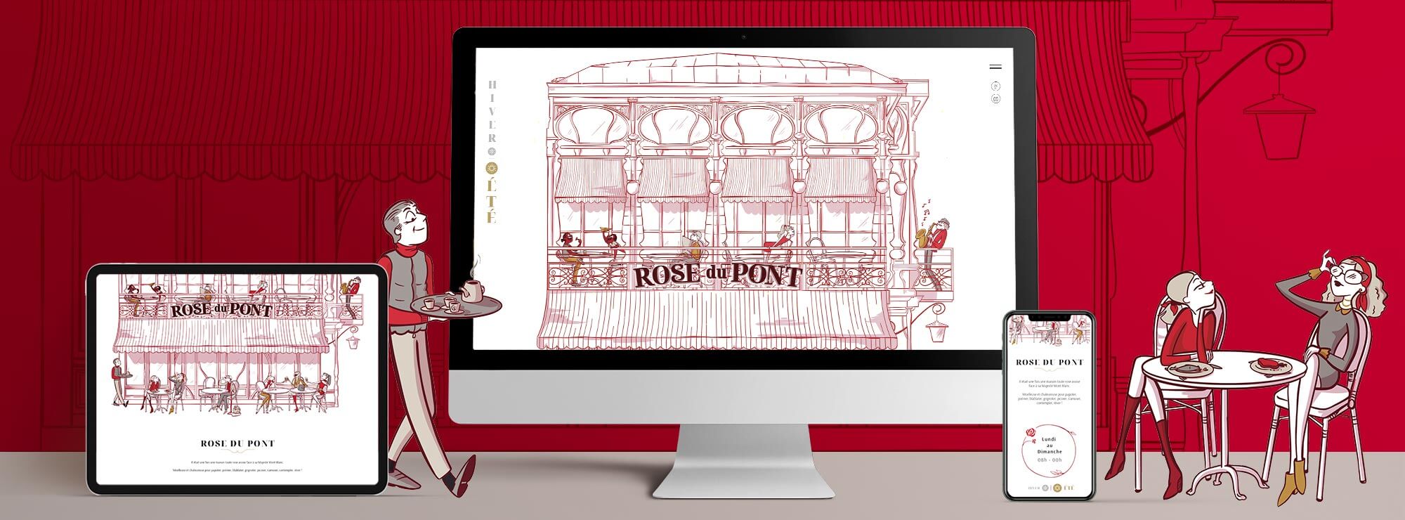
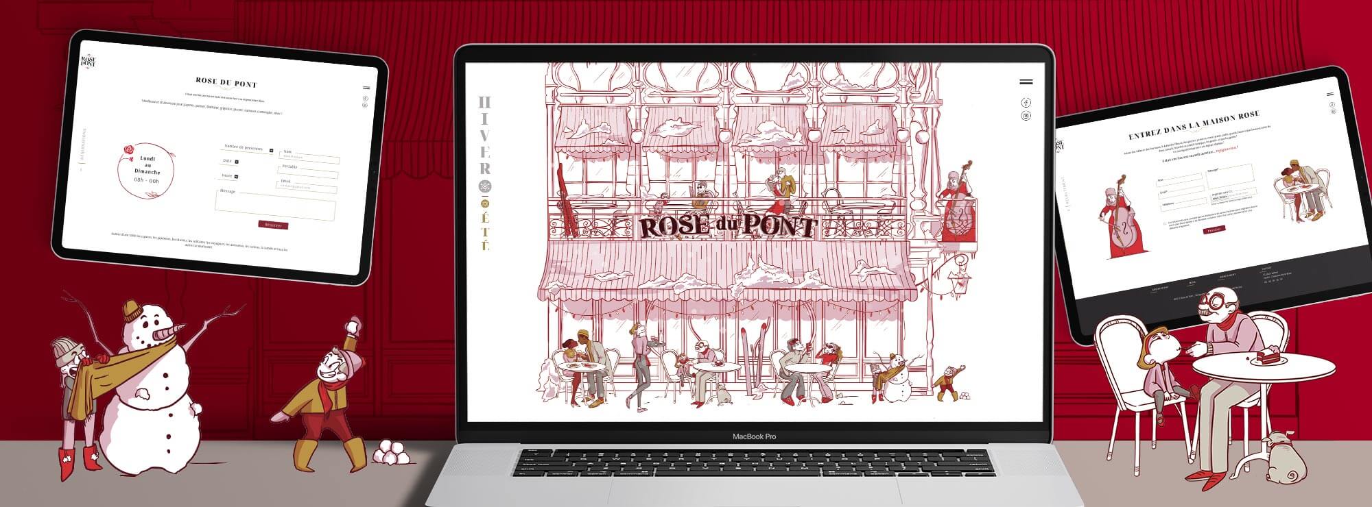
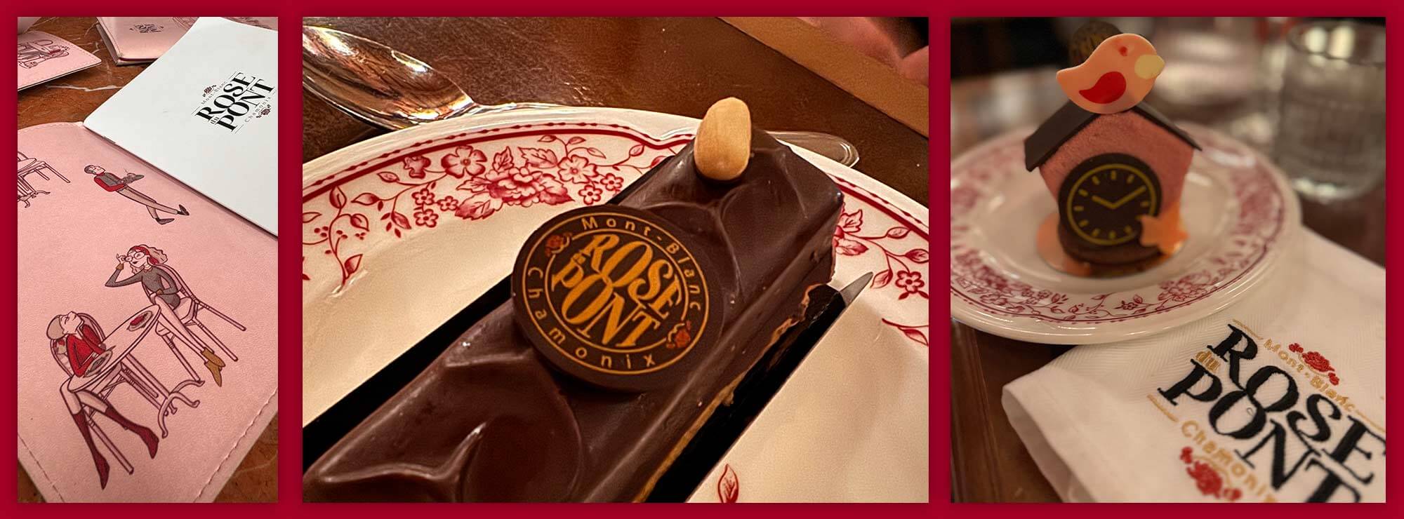
The agency rendered the property’s unusual architecture with a detailed illustration in a shade of burgundy pink. The figures, which represent the diversity of the restaurant’s diners and its sociable feel, are drawn in a style which is both contemporary and timeless, just like their clothing.
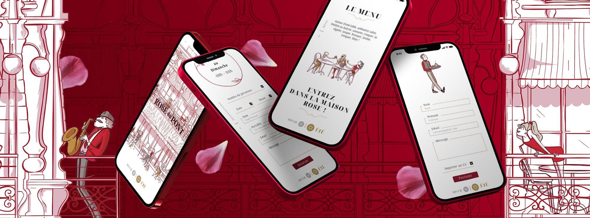
The illustrations and the tone of the texts create a website with real personality, which is both user-friendly and immersive: from the home page, visitors feel like they’re entering a truly unique world. The roses and illustrations which appear across the website give it a warm yet elegant feel.
A logo used everywhere
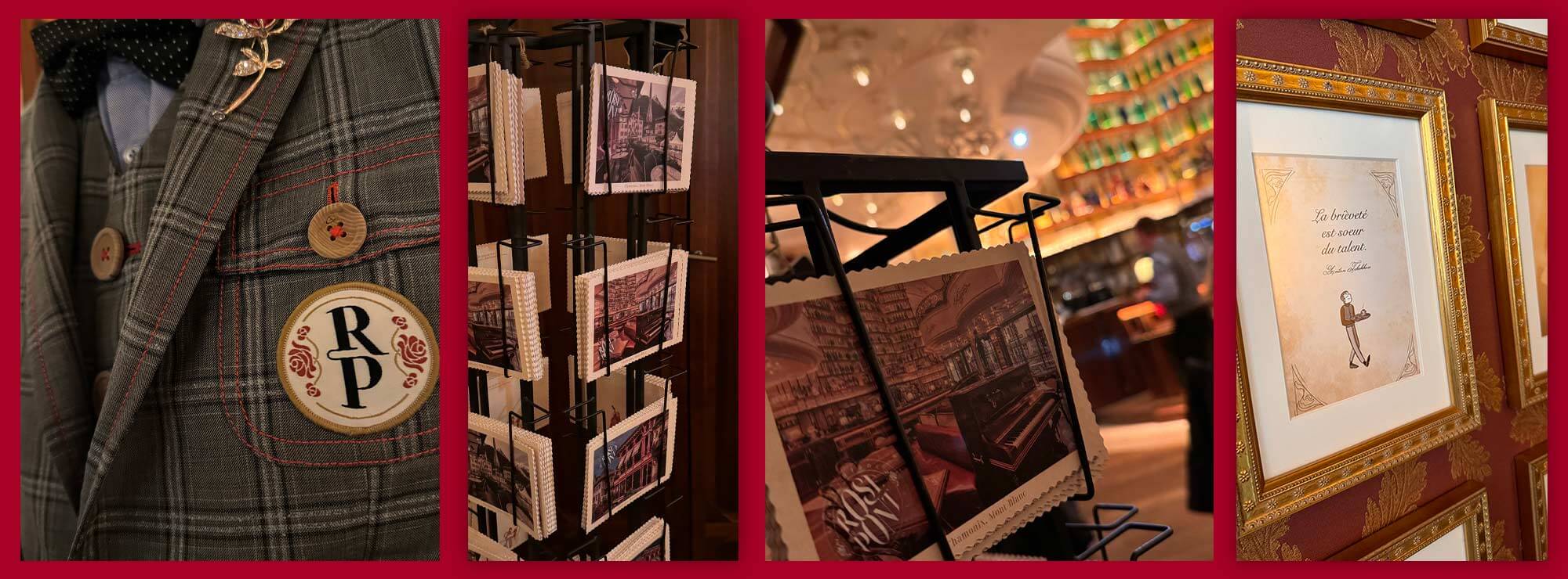
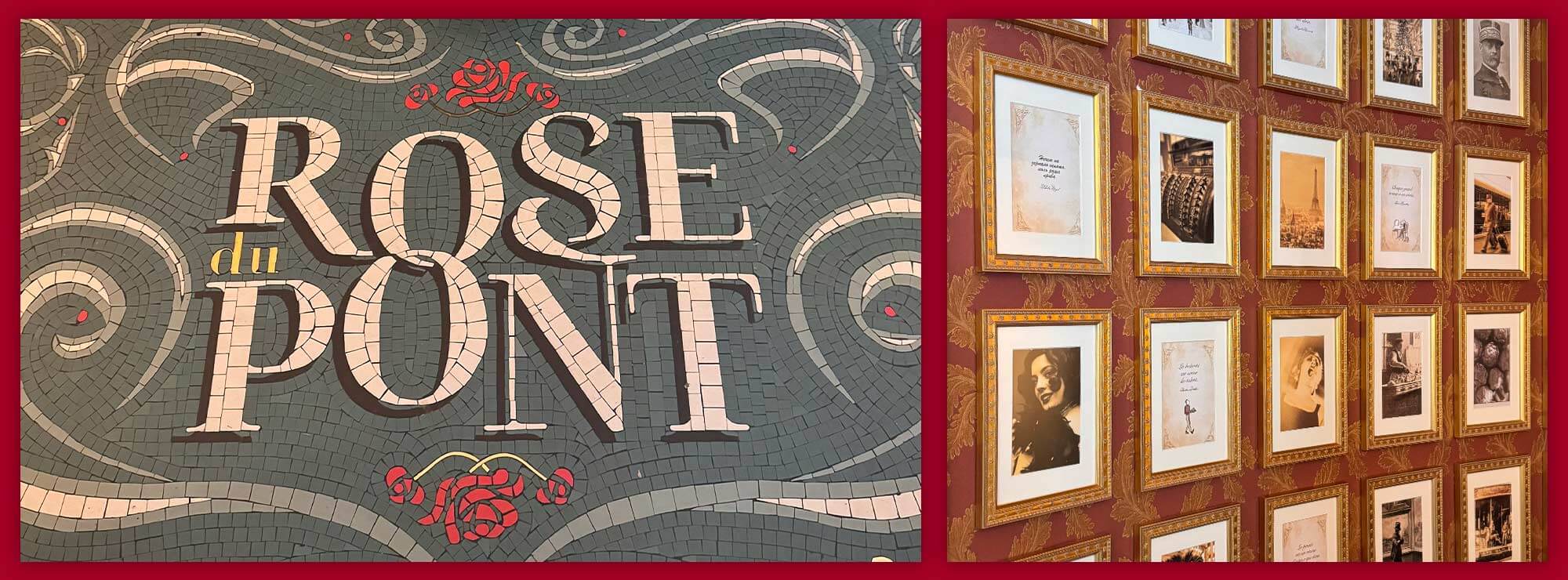
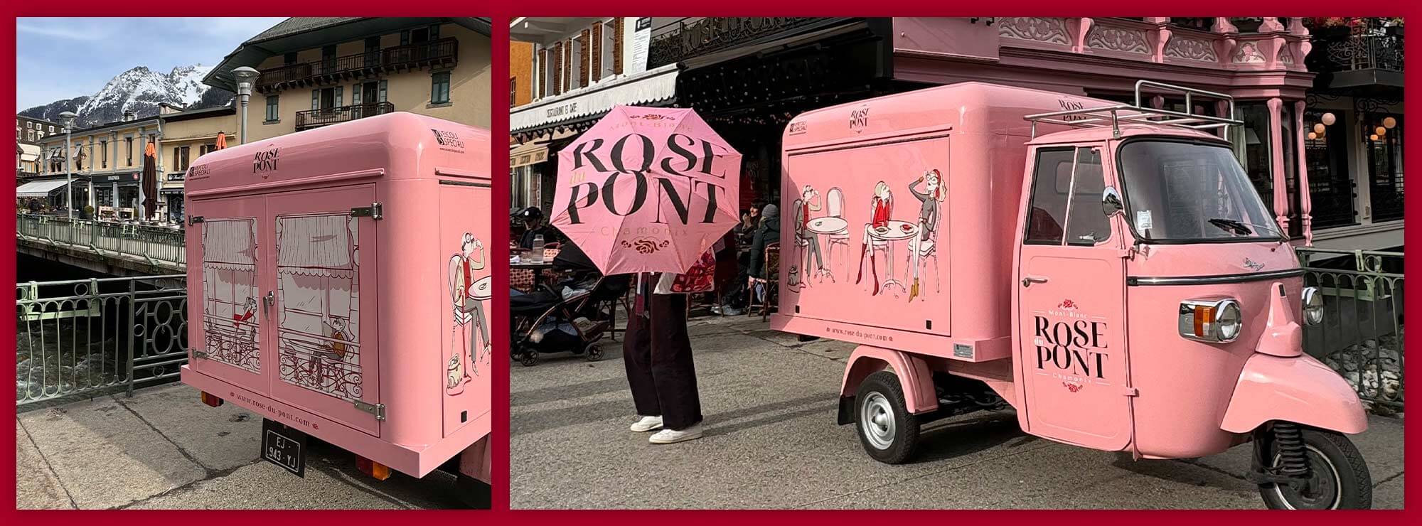
Unusually, our customer played the game and wanted to use the logo on absolutely every possible communication medium. Reproduced on the floor in mosaic, on the restaurant’s emblematic pastry, sewn onto napkins and waiters’ outfits, or even on the van that attracts passers-by... the new Rose du Pont logo is everywhere, but always in a subtle way to make a lasting impression.
A strong visual identity
In addition to the logo, the illustrations on the menu and the van also help to create a refined yet light-hearted atmosphere: the scenes depicted are cheerful and playful if you look at them closely. Le Rose du Pont’s brand universe and offering stand out from the multitude of traditional mountain restaurants with more "rough" decor and menus, and become a comforting refuge at any time of day.
This project is testimony to our collaboration with the architect Bro agence, where architecture meets communication to create spaces and an identity that speak and tell a story.
