for IMAGE REDESIGN
The customer and their needs
Founded in 1997, TRSb was initially an IT services company specializing in infrastructure management. Over the years, the group has expanded its areas of expertise through internal growth and acquisitions. As a result, several brands with very different identities coexisted, leading to complexities in managing both internal and external communications.
As part of its new strategy, management has asked us to strengthen the consistency of the brand image by reworking the group’s identity and its communication materials (website, brochure, video, etc.).
Our creative approach
After conducting a competitive analysis and an analysis of the existing communications, the agency recommends creating a new name for several reasons. On the one hand, the group’s name was associated with a single activity in the minds of the target audience and employees. On the other hand, we rarely recommend acronyms, which require explanation and are difficult to remember.
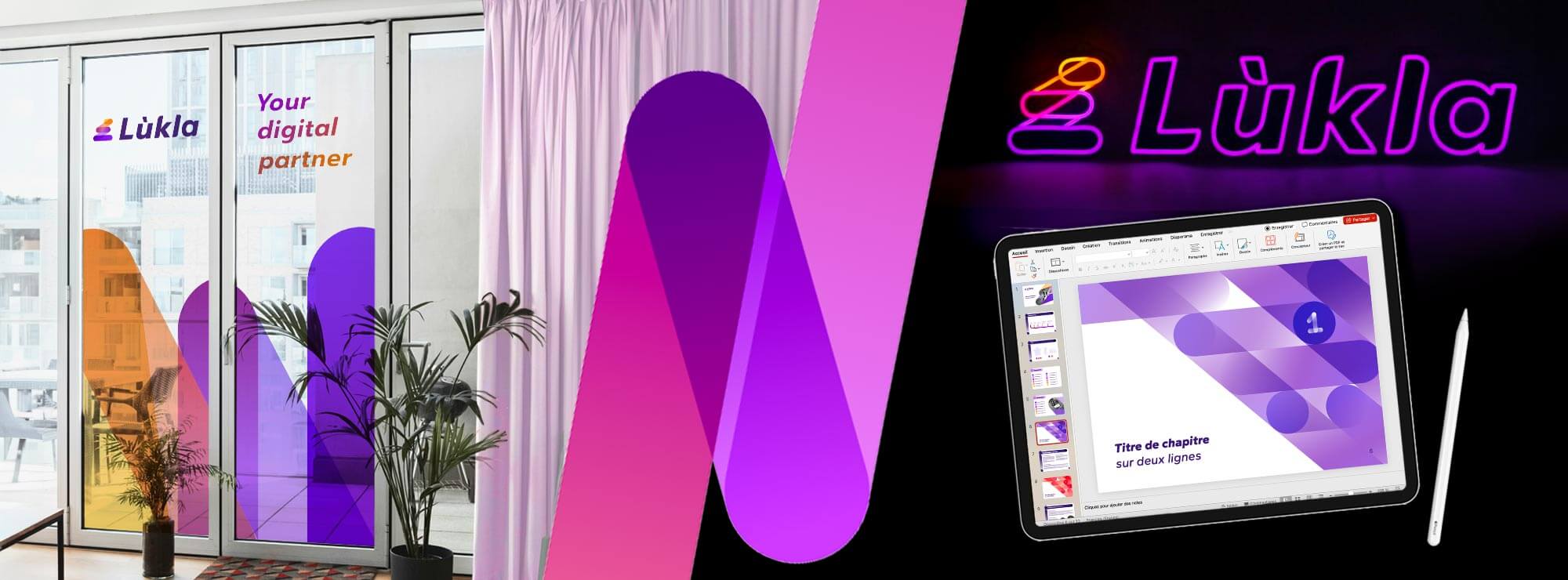
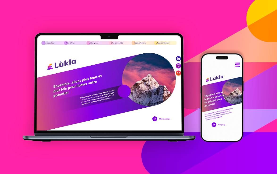
After defining a shortlist of name ideas to be legally verified, the chosen name is "Lùkla," the name of a and preparation for travelers visiting the Himalayas. The signature that accompanies it emphasizes a long-term partnership, rather than that of a mere service provider.
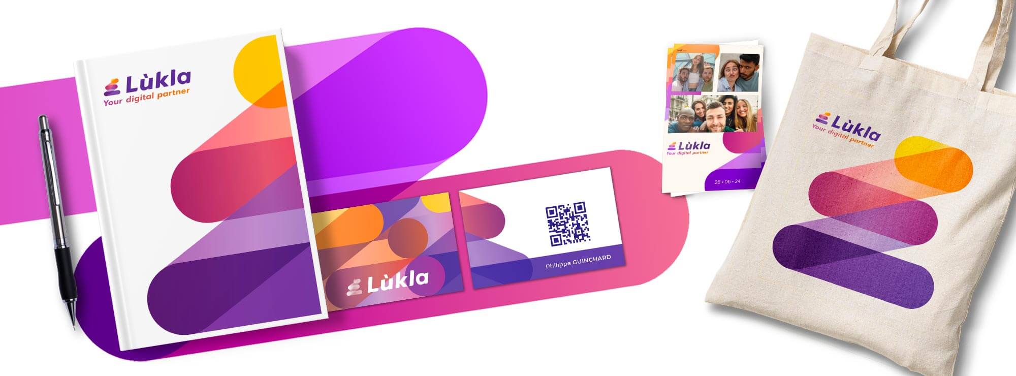
The brand mark, composed of several transparent connecting lines, symbolizes collective ascent. It can be interpreted as a staircase, a mountain, and steps. Its colors lighten as they ascend, symbolizing the path to success and a bright future.
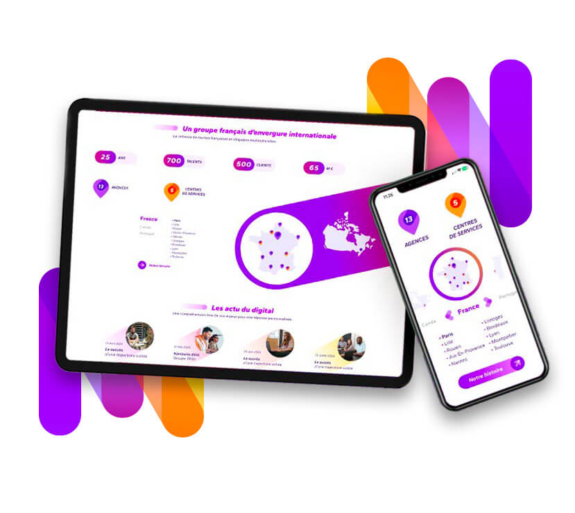
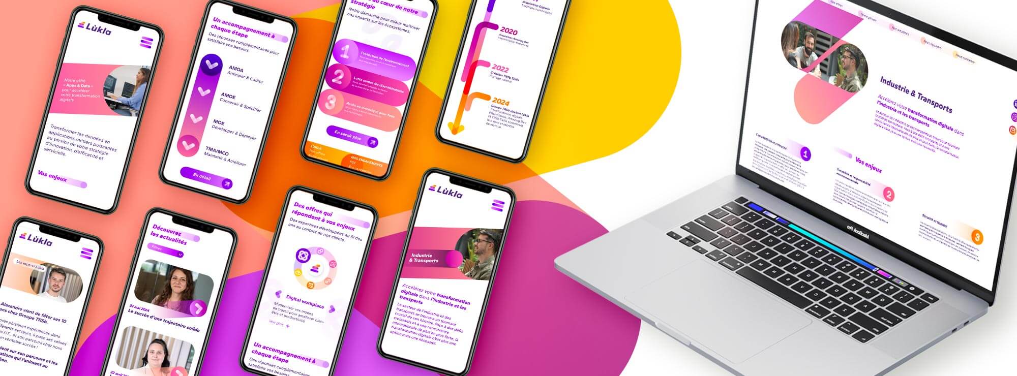
Distinctive and recognizable, its lines give rise to the creation of many other unique graphic elements on the new brochure and website: pictograms, diagrams, and background patterns incorporating photos… The typography in italics symbolizes the group’s dynamism and its forward-looking orientation. The colors, with a warm, digital gradient, evoke an evolution toward the light.
What our customer say
after working with us

The result
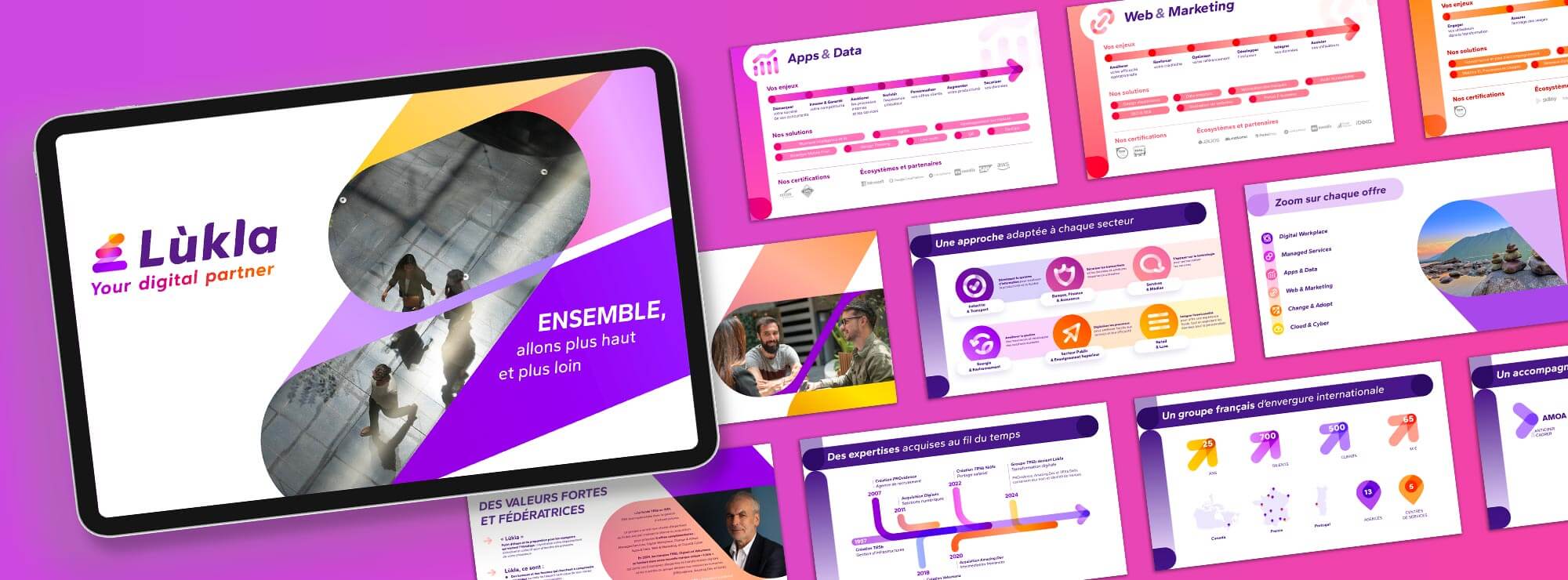
We needed to present this new strategy and brand to all employees in a compelling way, to unite them around a clear vision and facilitate its adoption.
Made for you therefore created a brand book that brings together all of Lùkla’s strategic and creative fundamentals, as well as a motion-design “reveal” video to fully bring the new visual identity to life and explore all its possibilities.
The logo’s lines come to life to tell the group’s story, convey its purpose and values, and showcase its new offerings.