The SOS Group is a non-profit organisation and a European leader in social entrepreneurship. It brings together 600 charitable associations, establishments and services which fight, act and innovate for the benefit of vulnerable people, future generations and local regions. Since it was founded in 1984, at the height of the AIDS crisis, the SOS Group has fought against all forms of exclusion, worked in the field to promote access to the essentials for all, helped charitable associations to safeguard their activities and jobs and innovated in response to new social, societal and environmental challenges.
In early 2022, the group chose to update its messaging, deciding to stop presenting its work by sector (young people, solidarity, culture, etc.) to focus on its beneficiaries. A new visual identity (logo and visual style guide) was also created and shared with the agency, in view of the website being updated.
The SOS group asked Made for you to adapt the design of some of its website pages to reflect these changes.
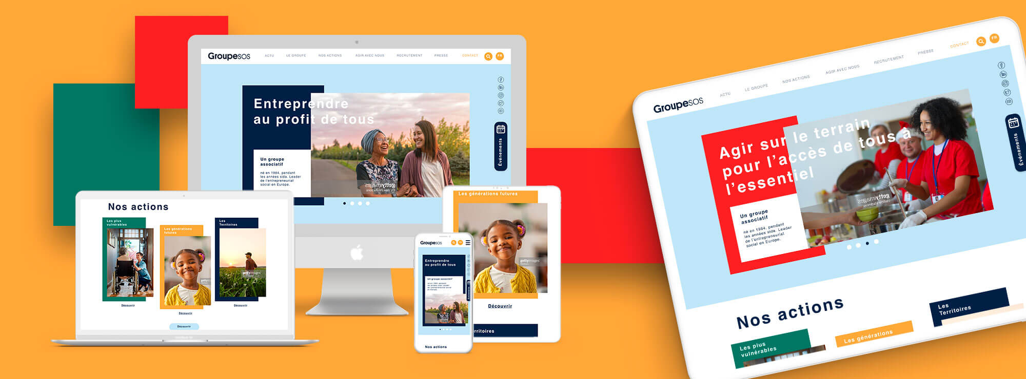
A streamlined yet vibrant design
The homepage’s design features solid blocks of colour and layered details which help to differentiate between the three kinds of beneficiaries: the most vulnerable people, future generations and local regions.
The same colour for each target is used on the dedicated page for those beneficiaries, ensuring consistency and vibrancy.
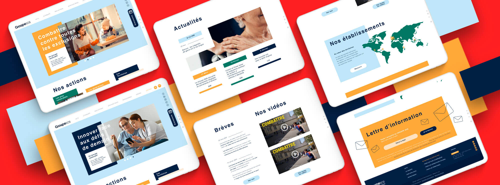
The content is streamlined and the website’s white background makes it clearer and more readable.
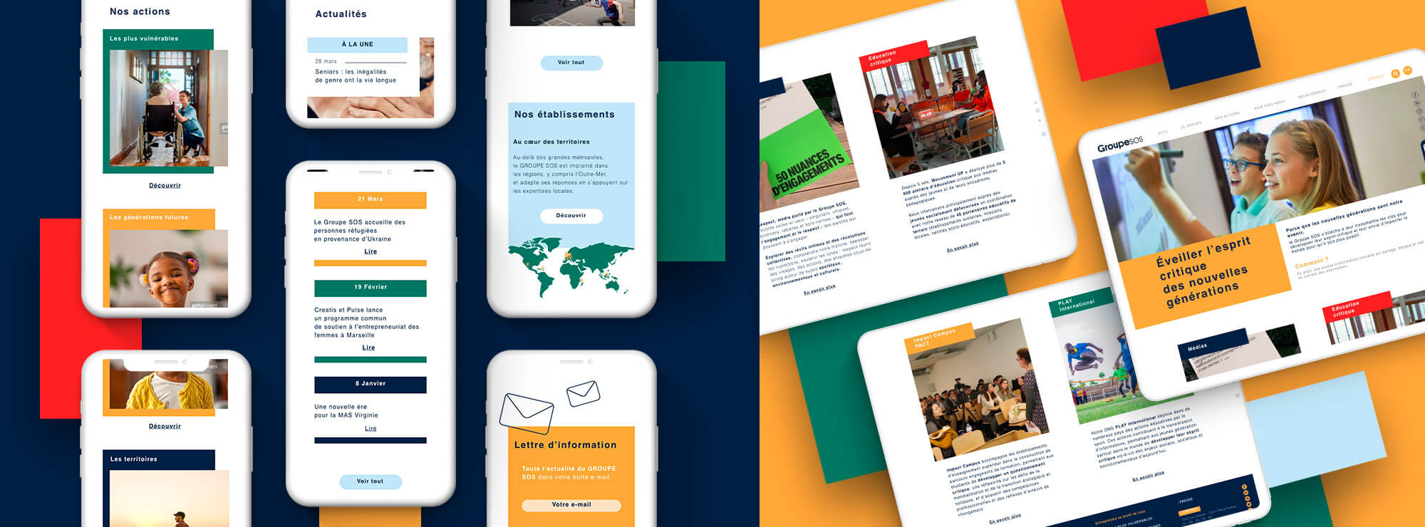
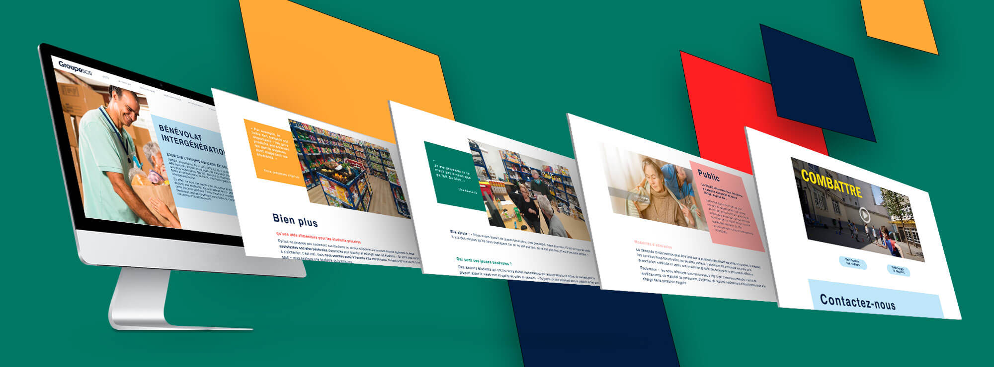
Photos which spark real emotion
The chosen photos show the different kinds of beneficiaries and focus on emotion (smiles, a hand on someone’s shoulder, etc.). As a result, the web design is more inviting and more personable, emphasising the support provided by the group’s teams who put people at the heart of everything they do.
The web design is uncluttered, ensuring that the information is easy to read, but illustrations, like the photos, add warmth: for example, the team created a world map for the homepage and “envelope” icons of varying sizes with a minimalist and original design. This creates a website which is professional yet welcoming.