The institute « Locomoteur de L’Ouest » regroups surgeons, doctors and radiologists specialized in various diseases as osteoarticular disorders.
The group searched for a powerful visual identity.
“ILO” seeks our expertise to conceptualize their logo as well as deploying their identity (business cards, Frontage, Power Point...)
EXPENDING AN IDENTITY
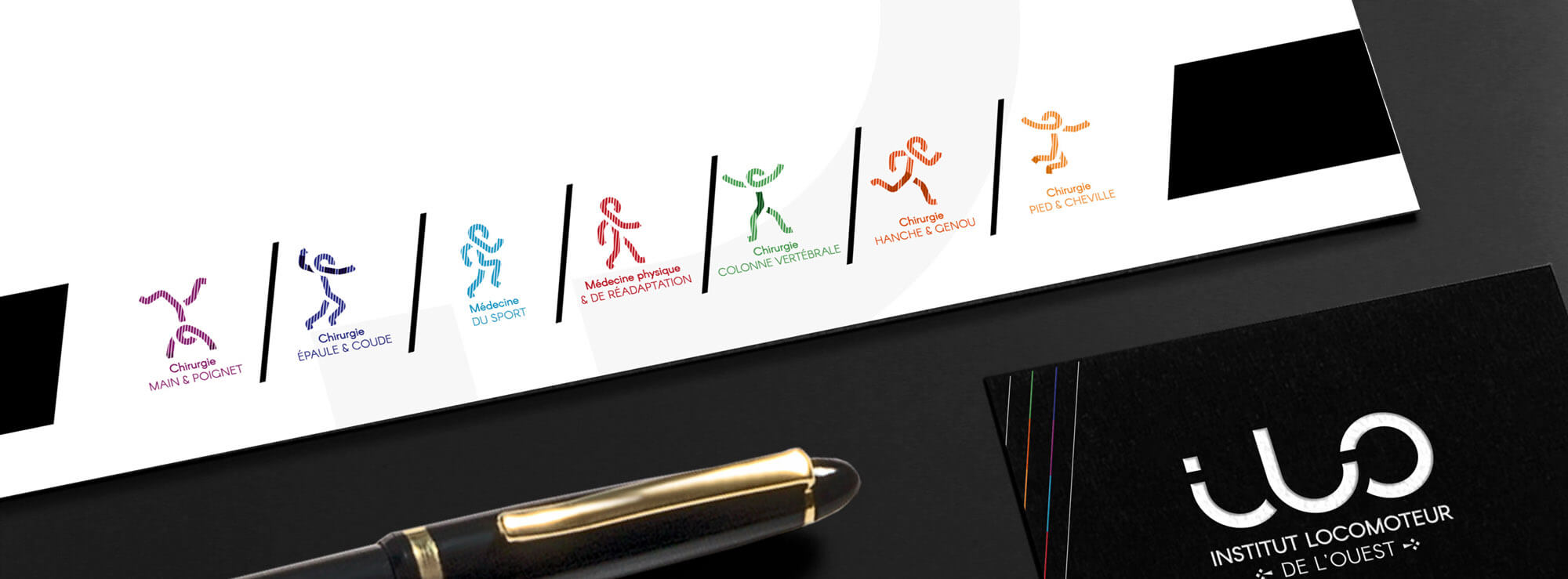
The agency created a logo that was modern to per tray the expertise, as well as relatable and « reassuring». The letters bounded together and with their rounded shape evoks the human body (articulations and movements, as is their specialty). Under the logo, the font in capital letters, evokes the discipline and the thoroughness of the team who practice in the first clinic ever in France, the “ CPH Saint Grégoire”. The color black reinforces that. However it is associated with vivid colors, representing the numerous field of expertise.
Adapt the graphic chart
The « O » of ILO is used in the pictogram to reinforce the visual identity we mean to create. The symbol of the ermine reinforces the regional dimension of the institute. Lines tending to the right on the faces and the business cards accentuate the idea of movement. We aslo design a prototype of power point presentation in order to reinforce the identity and visibility of Ilo.